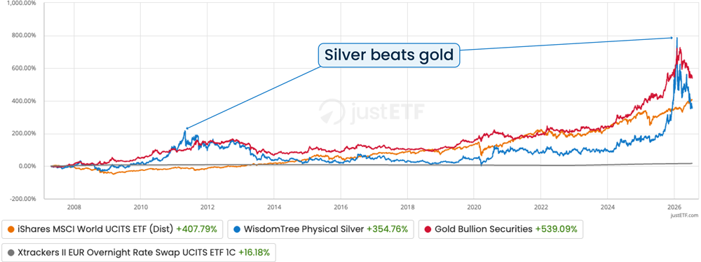
Silver had a tremendous run of late. In fact, following the 2025 rally, it pulled ahead of the MSCI World in a long-term comparison dating back to 2007.
Source: justETF detailed comparison, 20/04/2007-13/07/2026. All returns in this article are nominal returns in EUR.
Even after a subsequent 50 % slide, the precious metal still racked up a cumulative return of over 350 % over the period, putting it right on the heels of the MSCI World.
Source: justETF detailed comparison, 12/06/2026. All returns in this article are nominal returns in EUR.
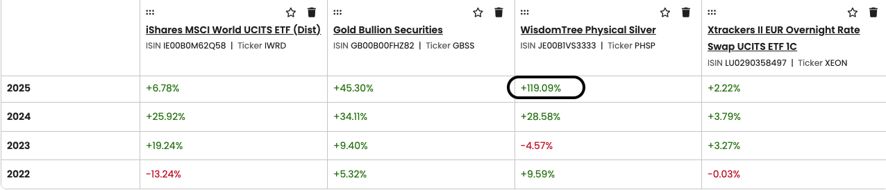
Silver smashed 2025 with annual returns of 119 %.
Source: justETF detailed comparison, 13/07/2026. All returns in this article are nominal returns in EUR.
Sometimes it tracks ahead of gold.
Meanwhile some commentators laud silver as a precious metal with diversifying properties akin to gold, buttressed by broader industrial demand that supports its long-term value.
All of which makes silver a very interesting proposition. So does the case stack up? Does the white precious metal have a useful role to play in a diversified ETF portfolio?
Let’s find out…
Silver’s long-term returns
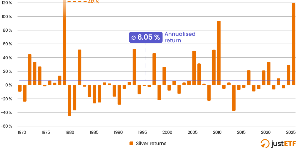
First, let’s get a sense of how silver behaves from its annual returns 1970 through 2025. One thing is certain, silver is volatile with a capital V:
Silver annual returns 1970-2025
Source: justETF research, 10.06.2026. Nominal monthly returns in EUR (EUR proxy before 1999).
The silver price rocketed 413 % in 1979. A meteoric rise that would reduce the other returns to insignificant stumps if we fully accommodated it on the chart’s Y axis. Hence we’ve cropped the scale at 120 %, and labelled the one-off surge with its return number as a compromise.
The 1979 price spike was an anomaly driven by the rampant inflation of the era, anxieties regarding the debasement of the dollar, and an audacious attempt to corner the silver market by US billionaires and their backers.
The US Commodity Exchange changed its rules at the time to neutralise the market manipulation, and you can see the bursting silver bubble deflate in 1980 to 1981.
That was then, but even today’s better regulated silver market regularly switchbacks between double-digit highs and lows - capped off by 2025’s triple-digit 119 % blowout.
Thankfully such swings are not associated with price rigging. 2025 is readily explained by soaring industrial demand and investment inflows (spurred by geopolitical uncertainty) running into a tight physical market. Escalating demand met constrained supply and the result was a sensational price rise.
As we saw in the earlier line chart, the trend topped out in January as silver blazed past gold. The market for both metals has cooled off since then.
All told, the long-term average return of silver is 6.05 % annualised. That’s highly respectable for a diversifying asset but should be treated with caution.
As the annual returns chart implies, the day-to-day experience of owning silver is nothing like a steady pipeline of 6.05 % annual returns.
If you regularly check your investments then silver is either famine or feast, agony or ecstasy, as we’ll see in the next section.
The long-term average return is almost irrelevant to the experience of ownership as the silver price so rarely lands anywhere near 6 % on an annual basis.
The story of that 1979-1980 price warp is even crazier when quoted in daily prices. The silver price leapt 721 % from 1 January 1979 to the all-time high (in USD) on 18 January 1980. If only we’d owned a few silver coins back then!
The rise and fall of silver
The next chart zeros in on the highs and lows of investing in silver.
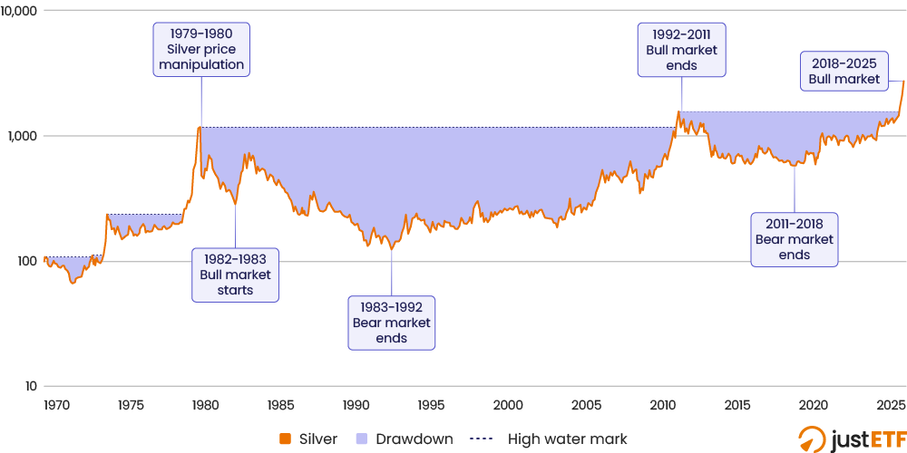
The blue line shows you monthly growth while the red zones reveal silver’s long drawdowns i.e. the periods spent underwater (if you bought in before the last market high):
Silver cumulative returns 1970-2025
The thirty year drawdown from February 1980 to March 2011 looks insane. It’s aggravated by the artificially inflated price bubble that we’ve already discussed.
If the silver price hadn’t been forced skywards in 1979-80 then the red zone would be shallower, it’s as simple as that.
All the same, once the price unwound, the market took off again: rising 156 % over 11 months from June 1982 to May 1983. This time there was no suggestion of foul play.
Silver’s purple patch didn’t last long. The market tipped into steep decline once more - bottoming out in 1992.
The dotted line on the chart shows that it took 17 years and 4 months for silver to recover its 1983 high. Silver was back in the black in September 2010.
That’s hair-raising enough but the chart reveals silver repeatedly cycles from boom to bust.
Silver peaked again in April 2011, plunging into a 14 year drawdown that only ended in 2025.
Bulls vs bears
The table below retells the story of the chart, but this time through the lens of its bull and bear markets (after the price rigging episode.)
In each case, the bull run tells you how good the upward leg was, while the bear mauling records the downturn:
Silver bull and bear markets
Market type
Dates
Silver cumulative return (%)
Duration
Annualised return (%)
Bull
Jun 1982-May 1983
156
11 months
179.1
Bear
May 1983-Aug 1992
-83
9 years, 3 months
-17.5
Bull
Aug 1992-Apr 2011
1158
18 years, 8 months
14.5
Bear
Apr 2011-Nov 2018
-63
7 years, 7 months
-12.4
Bull
Nov 2018-Jan 2026
572
7 years, 2 months
30.5
Bear
Jan 2026-May 2026
-25
4 months
-57.7
justETF Tip: the annualised return enables you to compare each period by averaging out the cumulative returns across time.
That is one white-knuckle roller coaster ride.
The initial bull market is a triple digit year. Beyond that, you’re looking at years of double digit losses or double digit growth. There’s no half measures.
1992 to 2011 was 18 years and 8 months of 14.5 % annual average returns. That’s amazing.
But could you have handled the preceding bear markets 9 years of -17.5 % average losses? Or the next bear’s 7 years of -12.4 % beatings?
The bull market from November 2018 to January 2026 generated stupendous 30.5 % annualised returns.
Nobody would say no to that. But silver is now down 50 % at the time of writing on July 20th.
If history is any guide then the next sliver slide could last for years.
So now we know that silver can make you look like an investing genius or an investing dunce. The next question is: does any amount of silver help diversify your portfolio?
Precious mettle
The next table compares the performance of silver and gold with equities during the worst World stock market crashes from 1970-2025.
We’ve also thrown in the 2022 market correction as a bonus. That’s because it was the first global inflationary shock in forty years and precious metals are reputed to cope well with high CPI.
That’s the set-up, then. For silver or gold to be worth their weight as diversifiers, they just need to perform less badly than equities under pressure.
Even a negative performance cushions your portfolio a little - so long as the diversifier’s dip is shallower than stocks.
Performance during worst stock market crashes
Stock market shock
Dates
World equities (%)
Silver (%)
Gold (%)
Vietnam War recession
Dec 1969-Jun 1970
-20.4
-11.3
-0.9
Oil Crisis 1
Dec 1972-Dec 1974
-52.5
69.2
116.5
Black Monday
Aug 1987-Nov 1987
-28.4
-13.5
-8.7
Japanese Asset Crash
Aug 1989-Sep 1990
-35.7
-24
-14.9
Dotcom Bust
Aug 2000-Mar 2003
-54.2
-26.5
3.8
Global Financial Crisis
May 2007-Feb 2009
-56
5.2
52.1
Covid Crash
Jan 2020-Mar 2020
-19.8
-21.2
2.2
2022 interest rate hikes
Dec 2021-Jun 2022
-13.5
-3.9
8.7
justETF FYI: the Vietnam War recession began in the US in 1968 but the MSCI World index starts from the end of December 1969.
Gold was the best asset to own every time. It’s true that silver was typically better than stocks too, so it would have dampened every crunch except the Covid Crash.
Yet gold is clearly the superior diversifier. What’s more, silver only managed a positive return twice. The other six times it was down, but stocks were even worse.
Meanwhile, gold registered a positive return five times out of eight.
Naturally, we can’t conclude from past results that silver will never outperform gold during a stock market rout.
But it’s rare for a strong defensive asset to always be second best like this.
The reason isn’t hard to fathom either. Industrial demand for silver is a significant component of its price. Naturally demand dwindles during a downturn and silver’s price softens.
In other words, silver is mostly positively correlated with the global economy in a way that conflicts with its defensive duties.
Government bonds, money market, and gold all seem better equipped to hedge a crisis on this evidence.
However, there’s a twist.
The silver bullet
Almost unbelievably, silver shines in our final test.
Sometimes highly volatile assets are worth holding in small quantities because they offer you the opportunity of a rebalancing bonus. That is, you can juice your returns by consistently buying low and selling high.
This is where silver comes good.
First, let’s dial up the annualised returns for World equities and our pair of precious metals:
Annualised returns World equities vs precious metals
Portfolio (1970-2025)
Annualised return (%)
100 % World equities
7.72
100 % Gold
7.17
100 % Silver
6.05
Obviously silver isn’t setting the world alight here.
Now check out these three diversified portfolios:
Annualised returns for diversified portfolios
Portfolio (1970-2025)
Annualised return (%)
60/40 World / gold
8.13
60/40 World / silver
8.41
60/20/20 World / gold / silver
8.43
Portfolios are annually rebalanced.
It’s counterintuitive but a side of silver improves portfolio returns even though it’s the worst asset of the bunch on an individual basis.
Is it a fluke? Perhaps this phenomenon depends on that 119 % 2025 return? Let’s strike that from the record and see:
Annualised returns excluding 2025
Portfolio (1970-2024)
Annualised return (%)
100 % World equities
7.74
100 % gold
6.58
100 % silver
4.66
60/40 World / gold
7.9
60/40 World / silver
7.85
60/20/20 World / gold / silver
8.03
Portfolios are annually rebalanced.
Silver still adds value even though its influence is less significant when measured before 2025’s triple-digit performance.
Okay, let’s see if the silver lining survives when we change the time period to the ETF / ETC era:
Annualised returns in the ETF / ETC era
Portfolio (Apr 2007-Dec 2025)
Annualised return (%)
100 % World equities
8.56
100 % gold
10.8
100 % silver
9.7
60/40 World / gold
10.09
60/40 World / silver
10.27
60/20/20 World / gold / silver
10.29
Time period starts from the earliest date we can compare ETFs / ETCs for each asset class. Portfolios are annually rebalanced.
Well now, gold wins because it’s enjoyed a stupendous run over this time frame. But the silver-laden diversified portfolios still top the group - though it’s a close run thing.
What is going on?
The secret lies in rebalancing between volatile assets. Just imagine rebalancing out of silver and into equities at the end of 2025, after silver shot up 119 %.
Silver vs World equities year-to-date performance 2026
Source: justETF detailed comparison, 13/07/2026. All returns in this article are nominal returns in EUR.
You took the profits from silver, ploughed them into equities, and enjoyed a nice buy-low, sell-high boost as stocks advanced while the precious metal fell back.
Health warning time: the rebalancing bonus doesn’t always work. In fact, it often doesn’t. But you can see that it’s had a positive impact on the precious metal, diversified portfolios we’ve considered in this article.
That’s because the rebalancing bonus is most likely to occur when the blended assets are highly volatile and low to negatively correlated.
You can be sure that equities, silver, and gold will remain volatile. Whether their future correlations create a significant rebalancing bonus, however, is not a given.
Moreover, we don’t recommend stuffing your portfolio full of precious metals in an attempt to engineer this kind of outcome.
To achieve the relatively slim bonus above, our hypothetical past investor had to rebalance into silver when - for example - it was losing -17.5 % per year for nine years straight from 1983 to 1992. That’s extremely hard to do in practice.
Still, this particular rebalancing phenomenon is useful to know about because it helps explain why other volatile assets - such as inflation-hedging commodities - can play a useful role in your portfolio, despite their chequered past.
Silver foiled
On balance, silver does not look like a must-have asset. It’s far more volatile than renowned wild rides: equities, gold, and commodities.
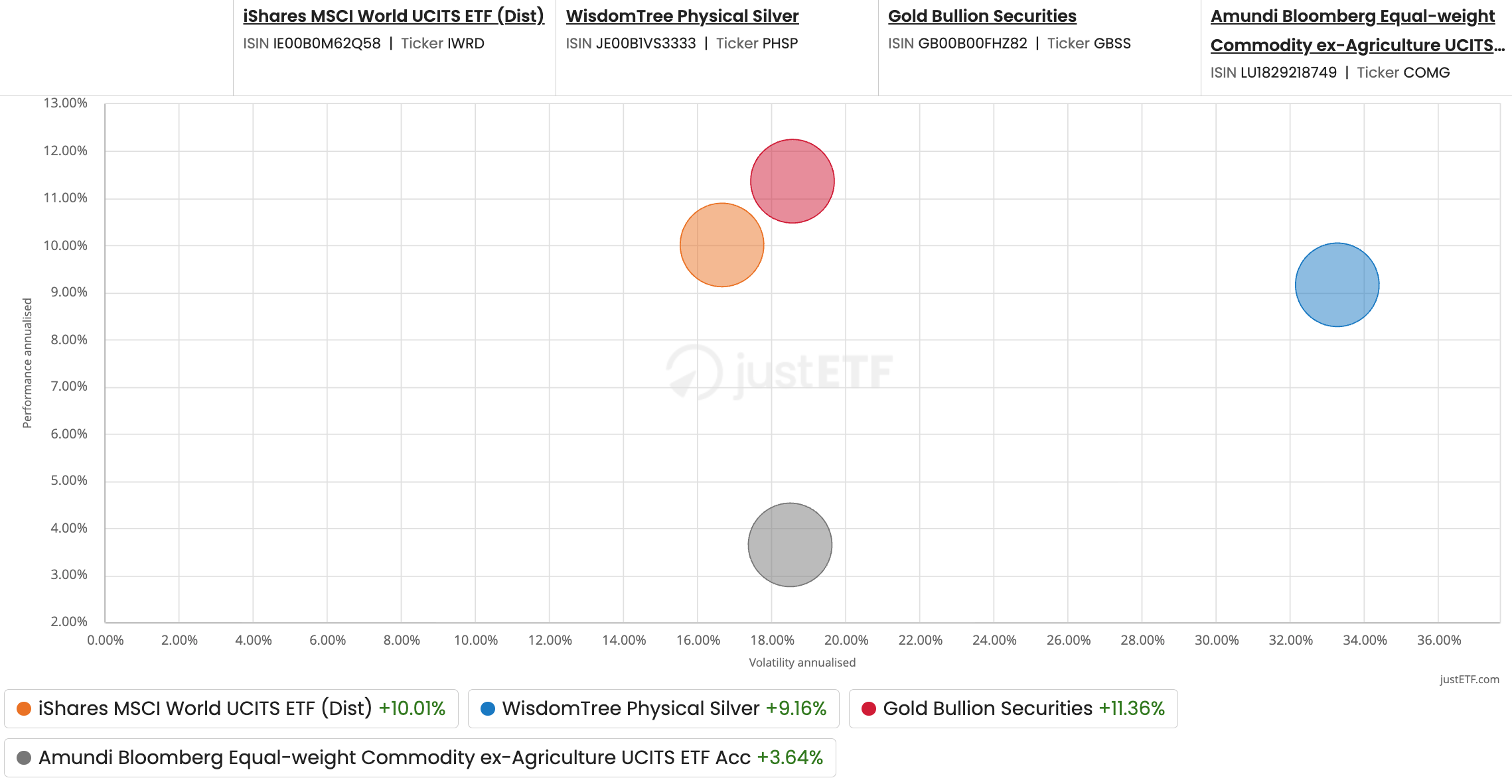
You can see this for yourself using our risk-return chart feature. Notice how silver (blue circle) is way out there on the volatility scale:
Source: justETF detailed comparison, 20/04/2007-17/07/2026. All returns in this article are nominal returns in EUR.
That means you’ll be in for a rough, tough, ego-bruising slog if you happen to invest during one of those prolonged silver bear markets.
Some investors eat volatility for breakfast. 50 % losses mean nothing to them because they can accept the risks and relentlessly focus on their long-term plan.
If you doubt that’s you then skip silver.


 The thirty year drawdown from February 1980 to March 2011 looks insane. It’s aggravated by the artificially inflated price bubble that we’ve already discussed.
If the silver price hadn’t been forced skywards in 1979-80 then the red zone would be shallower, it’s as simple as that.
All the same, once the price unwound, the market took off again: rising 156 % over 11 months from June 1982 to May 1983. This time there was no suggestion of foul play.
Silver’s purple patch didn’t last long. The market tipped into steep decline once more - bottoming out in 1992.
The dotted line on the chart shows that it took 17 years and 4 months for silver to recover its 1983 high. Silver was back in the black in September 2010.
That’s hair-raising enough but the chart reveals silver repeatedly cycles from boom to bust.
Silver peaked again in April 2011, plunging into a 14 year drawdown that only ended in 2025.
The thirty year drawdown from February 1980 to March 2011 looks insane. It’s aggravated by the artificially inflated price bubble that we’ve already discussed.
If the silver price hadn’t been forced skywards in 1979-80 then the red zone would be shallower, it’s as simple as that.
All the same, once the price unwound, the market took off again: rising 156 % over 11 months from June 1982 to May 1983. This time there was no suggestion of foul play.
Silver’s purple patch didn’t last long. The market tipped into steep decline once more - bottoming out in 1992.
The dotted line on the chart shows that it took 17 years and 4 months for silver to recover its 1983 high. Silver was back in the black in September 2010.
That’s hair-raising enough but the chart reveals silver repeatedly cycles from boom to bust.
Silver peaked again in April 2011, plunging into a 14 year drawdown that only ended in 2025.