The Permanent Portfolio is like the Swiss Army knife of investing. It’s a deceptively sophisticated selection of pieces that all have different uses. And just when you’re wondering what the point of a particular bit is, suddenly it proves its worth.
The classic Permanent Portfolio splits its asset allocation like this:
25 % Equities
25 % Gold
25 % Long-term government bonds
25 % Cash
It’s an unconventional mix in comparison to traditional 60/40 type portfolios, but there’s a sound rationale: the interlocking components habitually thrive under a diverse range of conditions.
That helps contain portfolio declines, lessen volatility, and often accelerates recovery. So as we’ll see in a moment, if your goal is to limit loss exposure and preserve capital without throttling growth, the Permanent Portfolio is well worth a look.
An all-weather portfolio
The four quadrants below show the role of each asset and the conditions it handles best:
Equities
Growth
Economic expansion
Cash
Liquidity
Rising interest rates
Long bonds
Recession / deflation protection
Falling interest rates
Gold
Chaos hedge
Crises of confidence
All-Weather strategies tend to downweight equities and load up on diversification. The trade-off is straightforward:
You hold significant slugs in assets that are likely to grow more slowly than equities over time.
However, their combined potential offers the prospect of a smoother portfolio ride when the markets cut up rough.
It’s a great idea and the evidence shows that it works.
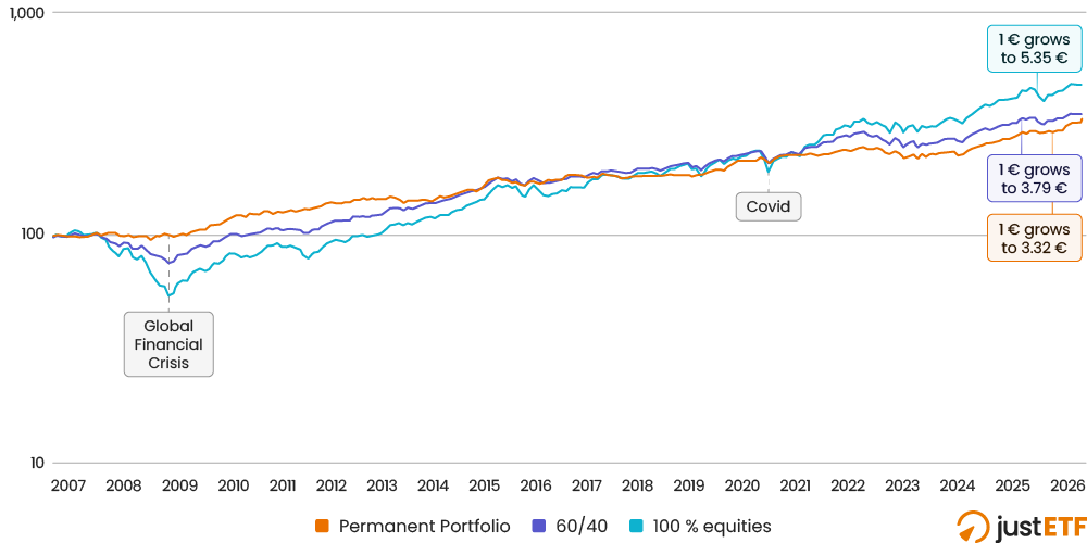
The chart below compares the growth of the Permanent Portfolio with the traditional 60/40 (equities/bonds) portfolio, and a high-risk, 100 % World equities position:
Portfolio growth comparison
Source: justETF research, 30.07.2026. Nominal monthly total returns in EUR (Jan 2007-Jun 2026). ETF fees included. Portfolios are annually rebalanced.
Permanent portfolio: 25 % World equities (MSCI World), 25 % Gold (GBSS), 25 % cash (XEON), 25 % long bonds (IBGL).
60/40 portfolio: 60 % World equities (MSCI World), 40 % intermediate bonds (IBGM).
100 % equities: MSCI World.
As you can see, the 100 % equities portfolio (black line) eventually outpaces its less risky rivals.
But it took until March 2017 for equities to nose ahead after the drama of the Global Financial Crisis (GFC). That’s over ten years from our start point in the early days of the UCITS ETF era. In all fairness, it should also be taken into account that setting the comparison's start date just prior to the financial crisis naturally skews the equity performance rather negatively.
The first ripples of the GFC spread outwards through the economy in 2007. Equities began to slide then plunged far further than the better diversified portfolios.
World equities were down 49 % at the height of the crisis. Against that, the 60/40 portfolio registered a 26 % loss, while the Permanent Portfolio barely buckled at -2.6 %.
The remaining craters in the black line show the pattern repeats over time - with the Permanent Portfolio typically riding over them like a monster truck.
Portfolio risk and return
The next table tells the story of the chart using key portfolio risk and return metrics:
Portfolio
Cumulative return (%)
Ann return (%)
Volatility (%)
Return per risk
Deepest drawdown (%)
Longest drawdown
Permanent Portfolio
233.5 %
6.37 %
6.34 %
1.01
-10.63 %
2y 5m
60/40
278.72 %
7.07 %
8.59 %
0.82
-26.01 %
3y 3m
100 % equities
434.9 %
8.98 %
13.52 %
0.66
-49.06 %
5y 8m
Return per risk = risk-adjusted returns. A higher number means that investors earned more return in exchange for the volatility they experienced. Higher numbers are better. Deepest drawdown for the Permanent Portfolio occurred in December 2022. It was February 2009 for the other two.
The first two metrics track returns. 100 % equities have clearly motored ahead in that respect.
But investors had to endure plenty of setbacks to get there - as revealed by the other four measures.
Those metrics take risk into account and, when you do that, the Permanent Portfolio tops the table.
In sum, the table encapsulates the nature of the Permanent Portfolio. Adopting it will likely cost you some growth in exchange for less downside pain.
Crisis management
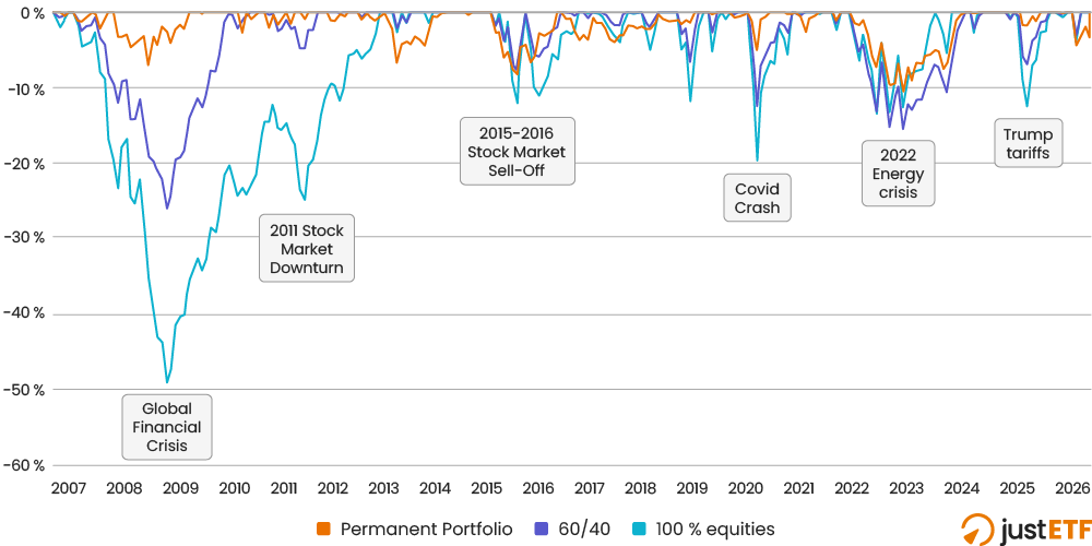
The next chart clearly illustrates the standout strength of the Permanent Portfolio - its resilience in the face of market shocks:
How the Permanent Portfolio copes in a crisis
Source: justETF research. Drawdowns Jan 2007-June 2026: Permanent Portfolio, 60/40 portfolio, 100 % World equities
The Permanent Portfolio is shaded red, with downward dips in the 60/40 and 100 % equities positions keyed in blue and black lines as before.
The chart shows you every backward step taken by the portfolios from their previous highs. The portfolios are underwater whenever their trendline dips below 0 %.
As you can see, the Permanent Portfolio practically snoozed through the Global Financial Crisis. That’s because long government bonds and gold were pulling hard in the other direction when the stock market crashed.
Quite aside from shock-resistant gold and bonds, it’s worth reflecting on the difference reducing equity exposure makes during a rout.
Remember that the 100 % equities portfolio was 49 % down at the worst point of the GFC.
That means equity losses for the 60/40 portfolio were 49 % x 60 % = 29 %
While the Permanent Portfolio’s equity losses were 49 % x 25 % = 12 %
With cash flat and the remaining 50 % of the portfolio rising in value as the stress intensified, you can see why the Permanent Portfolio was only 2.6 % down at peak crisis.
The strategy has worked again in almost every major stock market reversal since. The Permanent Portfolio’s robustness was particularly impressive in 2011, the 2018 downturn, Covid, and in 2025 when Trump’s tariffs were unveiled.
Of course, the Permanent Portfolio cannot protect you against every situation. It wasn’t much of an improvement during 2022 and has dipped further than its rivals during the Iran War.
Even so, the strategy was still less than 5 % down during March’s market retreat, and has recovered somewhat since.
Why does the Permanent Portfolio work so well?
The portfolio’s secret sauce is its complementary asset classes.
Equities, gold, and long bonds are all volatile asset classes on their own. But combined, they cover for each other’s weaknesses.
What’s more, the 25 % cap on each holding stops the portfolio folding like a deckchair when any single asset crashes hard.
The complementary nature of the strategy’s components is revealed in this asset class correlation chart we recently put together for the UCITS ETF era:
The low correlation between asset classes is clearly shown in the following table:
World Equities
Government bonds
Cash
Gold
World Equities
1
0.11
-0.13
-0.10
Source: justETF research. Nominal correlation of asset classes: December 2006 to February 2026
Low and negative numbers indicate the asset class is a good diversification partner for World ETFs.
Money market (cash proxy) and gold are negatively correlated with equities. Meaning they tend to move in the opposite direction from the stock market over time.
In other words, when stocks head down, there’s a reasonable chance that gold or money market will tick up, acting as a counterbalance.
Government bonds also have a low score, so they often behave differently from equities as well.
The Permanent Portfolio load-out prescribes long-term government bonds. That’s an even stronger form of bond than the intermediate maturity type shown in the chart above.
Long govies are likely to rise most strongly of all in a deep recession when central banks cut interest rates. The Global Financial Crisis was a textbook example of this class of event.
Central banks like the ECB and the Federal Reserve slash their main rates in order to prop up falling demand. Investors, meanwhile, flee into government bonds (the flight-to-quality effect) as stock prices drop.
High-quality long government bonds are a prized asset in this situation. They don’t mature for years down the line, so holders can collect a high rate of interest (relative to the tumbling central bank rate) until the storm passes.
On the other hand, long bonds can suffer badly when interest rates rise.
Interest rate risk reverses in this scenario. Now short maturity assets are king - as held by money market products.
The reason being that if interest rates go from, say, 1 % to 3 %, you don’t want to be left holding a bunch of 1 % interest-payers. The vast majority of money market securities mature in under three months.
So each holding matures quickly and your money is put to work in new higher interest-rate assets instead.
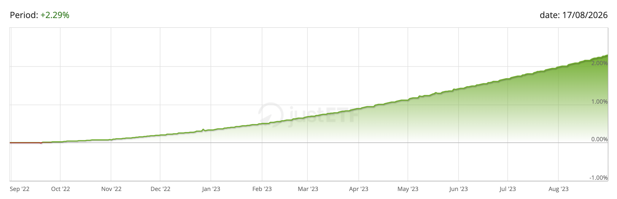
That’s why when interest rates rose in 2022, money market ETFs rose like this:
That leaves gold. Gold is highly unpredictable. It’s been a fantastic diversifier in the ETF era but it can decline for years too.
The lesson is, anything can happen with gold. That’s both its superpower and its flaw.
Investors have repeatedly turned to the yellow metal when the entire financial system is called into question. That’s why gold is sometimes called a “chaos hedge”.
When investors lose faith in mainstream financial assets then they often seek refuge in alternative stores of value. That’s where gold steps in. Which helps explain why the precious metal dazzled during eras when confidence crumbled such as the stagflationary 1970s and the Global Financial Crisis.
What if gold tips into a long bear market again? Well, the Permanent Portfolio answers this question by spreading its fortunes across four very different assets.
New investors typically go all-out for growth. That makes sense in the beginning.
But older investors need to think about protecting what they have as their wealth grows and their human capital runs down.
The Permanent Portfolio shines in this wealth preservation role. You can see for yourself in the charts and tables above that its downturns are generally shallow and short-lived.
That said, the hardest part of running a Permanent Portfolio is sticking to it. It’s tough to resist leaning further and further into equities when they’re on a multi-year tear.
There’s a danger of upweighting stocks at the frothy peak of the market - exactly when it's least useful to do so.
Meanwhile, the same dynamic runs in reverse during a nerve-shredding crisis. The portfolio needs to be rebalanced for its risk management strategy to work.
Rebalancing means selling whatever has held up (often gold or bonds) to buy more of whatever has fallen hard (often equities), which is the opposite of what feels sensible in the midst of a panic.
Thankfully this is a discipline that becomes easier with experience, so is more likely to suit older investors who are ready to derisk away from risky or less diversified portfolios.
Alternatively, you could simply adapt the core insights of the Permanent Portfolio to a modified version of your existing strategy.
Other popular all-weather variants hold 40 %-50 % equities. Some add commodities or tweak the long bond and cash holdings. Swapping long bonds for intermediate bonds is a popular change.
To create your own Permanent Portfolio, or improve your current level of diversification, go to:
Search
Find ETFs
Choose your asset class e.g. World equities or Precious Metals for gold
Click the sort icon to rank the ETFs / ETCs by fund size
The largest ETFs reveal the products that other investors hold
Check the TER is competitive
Check that the five-year return (5Y in %) is approximately the same as the ETFs nearest rivals. A couple of percentage points difference over five years isn’t anything to worry about.
Check the Return per risk number (Return/Risk 5Y) is roughly equivalent to similar ETFs.
You’ve just found a strong candidate for your next investment!