Gold has been on a tremendous run. Which begs the question, “Should you own it?”
Gold was the best performing asset class of the last ten years. A physical gold ETC returned approximately 14 % annualised versus 11 % for a World equities ETF from year end 2015 to 2025.
If you wanted to beat the stock market over the past decade then investing in gold was one way to do it.
Gold also has a habit of performing when equities tumble.
So it’s an asset that’s delivered remarkable returns of late? Plus it has a track record of delivering when equities don’t?
It’s time to look at what happens if we switch up our asset allocation to include a serious chunk of gold…
The results are clear in the ETF era so far: the more gold you held, the better you did.
Here’s the annualised returns for World equities, gold and Euro government bonds over the past 5 to 20 years:
Performance over 5 to 20 years
Time horizon (years)
World equities
Gold
Government bonds
5
12.86 %
18.41 %
-2.84 %
10
11.10 %
13.69 %
0.20 %
15
11.35 %
8.21 %
2.52 %
20
8.34 %
10.75 %
2.99 %
Source: justETF research, 07.02.2026. Nominal annualised total returns in EUR (2006-2025).
The table shows that gold wins every period, bar one, across the past twenty years. While bonds trail in dead last every time. Even the mighty World equities beat gold just once - over the past 15 years.
What tripped up gold in the 2011 to 2015 period? Well, the 31 % loss in 2013 didn’t help.
However, the bottom line is that 100 % gold was the best allocation you could pick for the years 2006 to 2025.
All gold couldn’t be beaten by any other clever blend of the main asset classes.
Did many people think, “Stuff diversification!” and go all-in on gold on New Year’s Eve 2005? Probably not.
Why not?
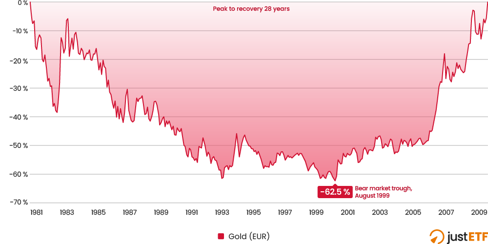
Because gold is capable of long periods of underperformance too. Check out the 28 years it spent underwater from October 1980 to January 2009:
Gold's biggest bear market 1980-2009
Source: justETF research, 07.02.2026. Nominal monthly returns in EUR.
The gold price kept on falling for almost 19 years until August 1999. Then it took another nine years to climb out of the hole - finally breaking even again at the start of 2009.
It’s events like this that mean we have to turn the clock back over 20 years to gain a more rounded view of gold.
Perhaps gold will never experience such a terrible slump again. Maybe it was dragged down by a unique set of circumstances that won’t be repeated. Theories abound.
But the fact is that every asset class can and has experienced eras of stagnation. And while historical returns don’t predict what will happen, their value lies in opening our eyes to what can happen.
That’s why a 100 % gold allocation is ill advised. Why a 100 % anything portfolio is an unnecessary risk.
Big crashes (one happened to bonds in 2022) are not evidence that an asset class is broken. They are evidence that all worthwhile investments are risky.
We take risk to earn reward. For the reward to be meaningful, the risk must inevitably materialise every so often. As it did with bonds in 2022, gold in 2013 (and 1980-1999) and equities, every time the stock market suffers a serious setback.
Gold mine
So let’s dig deeper into the asset class archives for a broader perspective on what gold can do.
The longest useful comparison period available begins in 1970 - with the inception of the MSCI World index. Gold was emerging as a properly investible asset class around the same time, liberated in stages from its price control shackles, after more than a century of government regulation.
This next table compares our three main asset classes over timelines going back to 1970:
Long term asset class comparison
Time horizon (years)
World equities
Gold
Government bonds
5
12.86 %
18.41 %
-2.84 %
10
11.10 %
13.69 %
0.20 %
15
11.35 %
8.21 %
2.52 %
20
8.34 %
10.75 %
2.99 %
25
6.11 %
10.21 %
2.71 %
30
8.45 %
8.68 %
2.45 %
35
8.78 %
7.36 %
2.60 %
40
8.12 %
5.50 %
2.45 %
45
9.25 %
3.98 %
2.61 %
50
8.99 %
6.01 %
2.75 %
56
7.65 %
7.31 %
3.06 %
Source: justETF research, 07.02.2026. Nominal annualised total returns in EUR (1970-2025).
Now we can see that gold and World equities have both enjoyed significant spells of dominance over the long term.
Indeed if you simply compared gold and equity average returns going back to 1980, you’d see that equities beat gold by over five percentage points every year for 45 years.
That time horizon is particularly bad for gold because it's particularly influenced by the precious metal’s 19-year price plunge from 1980 to 1999.
In other words, if you invested your money in gold 45 years ago, you’d be pretty disappointed.
Whereas if you’d bought and held a gold ETC just five years ago, you’d be patting yourself on the back.
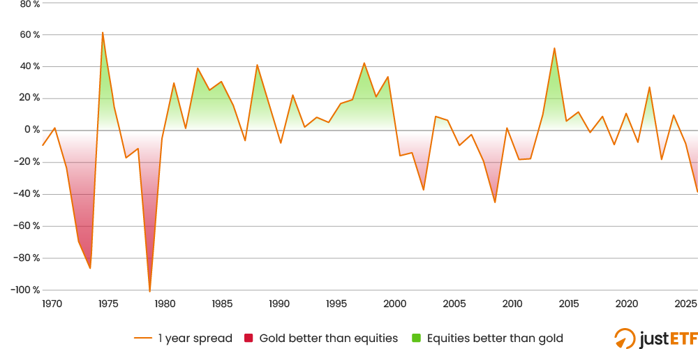
The next chart helps clear up why the best asset crown keeps switching between equities and gold:
Switchbacks: world equities vs. gold
Source: justETF research, 07.02.2026. Nominal annual total returns spread in EUR (1970-2025).
The blue trendline dives down every year that gold beats equities and vice versa.
If you look to the right-hand side of the chart, you can see that the reason gold looks so good over the past five years is because it notched up a series of big wins over equities from 2020.
Equities mostly had the whiphand from 2010 to 2019, while gold surged from 2000 to 2009 (the infamous lost decade for equities, marred by the Dotcom Bust and the Global Financial Crisis).
In fact, if you score it by decade, gold and equities have won three apiece:
Decade by decade comparison
Decade
World equities
Gold
1970s
-2.01 %
19.77 %
1980s
18.53 %
-1.25 %
1990s
13.04 %
-2.36 %
2000s
-3.73 %
10.66 %
2010s
11.90 %
5.42 %
2020s
11.67 %
17.57 %
Source: justETF research, 07.02.2026. Nominal annualised total returns in EUR (1970-2025).
The upshot is that diversification is the only way forward - because no-one can predict which asset will dominate the years ahead.
Plus, one thing that leaps out from the table is that when one asset disappoints, the other usually brings home the bacon.
This suggests that, over the long-term, World equities and gold are good portfolio partners. That is, when equities are down, gold is often up. And the same in reverse. This is precisely the trend we’re looking for in complementary pairs of diversifying assets.
What a pair
This intuition is confirmed when we use gold as the sole diversifier in a classic 60/40 portfolio:
60/40 Equities/Gold Portfolio Performance
Time horizon (years)
World equities
Gold
60/40 Equities/Gold
5
12.86 %
18.41 %
15.61 %
10
11.10 %
13.69 %
12.44 %
15
11.35 %
8.21 %
10.60 %
20
8.34 %
10.75 %
9.92 %
25
6.11 %
10.21 %
8.34 %
30
8.45 %
8.68 %
9.19 %
35
8.78 %
7.36 %
8.80 %
40
8.12 %
5.50 %
7.64 %
45
9.25 %
3.98 %
7.72 %
50
8.99 %
6.01 %
8.49 %
56
7.65 %
7.31 %
8.49 %
Source: justETF research, 07.02.2026. Nominal annualised total returns in EUR (1970-2025). 60/40 portfolio rebalanced annually.
Check out the longest-term result in the final row of the table. Over 56 years, neither 100 % equities nor 100 % gold was the best choice.
The best return - 8.49 % annualised - was delivered by a 60/40 World equities/gold portfolio.
"The only free lunch is diversification," is one of the most famous quotes in investing. That 8.49 % win is a free lunch.
Forget bonds?
Sadly, there’s no guarantee that equities and gold will always work so well together, which is why we shouldn’t rule out government bonds.
Without doubt, government bonds have been poor and cash has been even worse if you look back over any reasonable length of time.
But that poor performance does not equate to bonds being useless.
Nominal government bonds are your go-to when interest rates fall, or a demand-led recession hits, or deflation sets in.
The trade-off is bonds don’t cope well with rapid hikes in interest rates, inflationary surges, or stagflationary recessions.
In other words, government bonds - like all other assets - rise in particular economic circumstances but wilt when conditions do not suit them.
Yet happily for portfolio builders, bonds and gold are also complementary assets. We can check this by examining the diversification potential of all three asset classes via a correlation matrix:
justETF Tipp: An investment correlations table shows how closely related the returns of pairs of assets are to each other. The relationships are understood by reference to the following framework:
1 = Perfect correlation. An upward move in one asset is mirrored by an upward movement in the other. They fall in synchronicity too.
0 = No correlation. The returns of the two asset classes are unconnected. If one investment rises (or falls), anything could happen to the other.
-1 = Perfect negative correlation. When one asset class weakens, the other will strengthen and vice versa.
For example, a score of 0.9 indicates that a pair of asset classes behave much alike. Their diversification potential is low.
Near zero numbers suggest the two assets behave quite differently and so may usefully compensate for each other’s weaknesses.
Essentially, gold and bonds are uncorrelated to World equities over the period, while they’re only weakly correlated to each other.
From a diversification perspective, this is great news because it means that if gold fails, bonds will often step in and vice versa.
So if we include bonds in our returns by decade table, it turns out they’re better than gold in three decades out of six. In fact, bonds usually occupy a more stable middle ground between the two wilder assets:
Asset comparison including government bonds
Decade
World equities
Gold
Government bonds
1970s
-2.01 %
19.77 %
4.88 %
1980s
18.53 %
-1.25 %
2.88 %
1990s
13.04 %
-2.36 %
2.46 %
2000s
-3.73 %
10.66 %
2.58 %
2010s
11.90 %
5.42 %
5.47 %
2020s
11.67 %
17.57 %
-1.72 %
Source: justETF research, 07.02.2026. Nominal annualised total returns in EUR (1970-2025).
Government bonds' lack of correlation with equities and gold means they potentially add another layer of protection to portfolios.
Indeed, bonds played this role during the recessions of the early 1980s and 1990s, bearing up when equities and gold both faltered.
Putting it all together
Now let’s pit equities and gold against a three-way allocation including bonds as well (right-hand column):
Three-way portfolio comparison
Time horizon (years)
World equities
Gold
60/40 Equities/Gold
60/20/20 Equities/Gold/Gov bonds
5
12.86 %
18.41 %
15.61 %
11.20 %
10
11.10 %
13.69 %
12.44 %
9.69 %
15
11.35 %
8.21 %
10.60 %
9.33 %
20
8.34 %
10.75 %
9.92 %
8.30 %
25
6.11 %
10.21 %
8.34 %
6.81 %
30
8.45 %
8.68 %
9.19 %
7.89 %
35
8.78 %
7.36 %
8.80 %
7.80 %
40
8.12 %
5.50 %
7.64 %
7.00 %
45
9.25 %
3.98 %
7.72 %
7.41 %
50
8.99 %
6.01 %
8.49 %
7.76 %
56
7.65 %
7.31 %
8.49 %
7.48 %
Source: justETF research, 07.02.2026. Nominal annualised total returns in EUR (1970-2025). Diversified portfolios rebalanced annually.
Remember, we’re in this for the long haul, so we’re more interested in the rows near the foot of the table. Those results are conditioned by a wider variety of circumstances, and so help us filter out the excessive influence of recent hot streaks.
Once again the 60/40 equities/gold portfolio delivered the best long-term return over the full period. But the 60/20/20 portfolio also served up a surprisingly creditable long-term result: 7.48 %.
That’s despite the weak bond returns we saw earlier.
A smoother ride
In reality, most people don’t only care about returns. Not when they’ve seen a wedge of their wealth disappear in a stock market flash.
Thus people care about volatility too, and the length and depth of the portfolio drawdowns that are an unavoidable part of investing.
This is why government bonds are a staple part of asset allocation. They add balance. That’s because they enjoy low correlations with equities and gold, as we’ve seen, and they’re generally more stable, too - as shown by the volatility numbers:
Volatility measures how violently an asset’s fortunes fluctuate. Everyone knows equities are wild, but gold is wilder still.
Government bonds are the chill members of the group.
The longer you invest, the more important that becomes. For the simple reason that reversals are harder to take when you’ve got a larger portfolio on the line.
Our Return per Risk metric is designed to address that. It’s a risk-adjusted performance measure that divides an asset’s annualised return by its volatility.
A higher Return per Risk number means that an asset has delivered more reward for every unit of risk (as measured by volatility) its investors have endured over a particular period.
Think of it as investing’s answer to the value for money question. When we make a purchase, we don’t just care about its quality, we care about how much we must pay for that level of quality.
Quality divided by price is value for money. The investing equivalent is return divided by volatility.
Risk-adjusted performance
The last step, then, is to examine the risk-adjusted return performance of our potential portfolios using the Return per Risk metric. Higher numbers are better:
Return per Risk comparison
Time horizon (years)
World equities
Gold
60/40 Equities/Gold
60/20/20 Equities/Gold/Gov bonds
5
0.72
0.973
1.173
0.846
10
0.755
0.929
1.071
0.892
15
0.885
0.482
1.031
1.014
20
0.516
0.667
0.823
0.775
25
0.349
0.652
0.631
0.579
30
0.458
0.575
0.706
0.665
35
0.494
0.49
0.681
0.672
40
0.442
0.365
0.566
0.58
45
0.515
0.258
0.587
0.631
50
0.5
0.278
0.577
0.633
56
0.394
0.325
0.59
0.604
Source: justETF research, 07.02.2026. Return per Risk (1970-2025).
Once again, it’s the longer term results which help us extract the signal from the noise.
And on that view, the 60/20/20 portfolio is the best value for money because it offered the most return per unit of risk investors had to take.
Or, from a free lunch perspective, the three asset portfolio made its calories the easiest to swallow.
Treasure seekers
Be that as it may, our original question was how does gold improve our portfolios? By now it’s obvious that gold has a useful role to play in contemporary portfolio diversification.
The lingering doubt is that the yellow metal is extremely hard to value because it has little intrinsic worth. Gold is not like a portfolio of shares in the world’s leading companies that collectively generate trillions in annual revenue. Or like bonds that deliver precise sums of interest. Or other commodities that can be sold on the world markets.
Global demand for jewellery and gold’s limited industrial uses would not alone sustain the price of gold at its current levels. So the remainder of the puzzle lies in its perceived value as an alternative store of value. To some extent gold is an analogue cousin of bitcoin. Albeit with a much longer history and no Satoshi.
So whatever you do, don’t get gold fever. Don’t go all in, and bear in mind that calamitous 1980 to 2009 drawdown.
But so long as you understand the risks, the long-term behaviour of gold indicates that a reasonable allocation of 10 % to 25 % has the potential to add significant diversification benefits to your portfolio over the long run.
1970-2005 German government bond total return index (REX). JST Macrohistory. (Òscar Jordà, Katharina Knoll, Dmitry Kuvshinov, Moritz Schularick, and Alan M. Taylor. 2019. “The Rate of Return on Everything, 1870–2015.” Quarterly Journal of Economics, 134(3), 1225-1298. Accessed February 2025).