It’s easy to see which ETFs have enjoyed great returns recently. Just visit our Best ETFs page to see the hottest performers in the UCITS ETF league table.
But how can you tell if an ETF is likely to be there for you when times are tough?
After all, diversification is one of the golden rules of portfolio building. Everybody knows the market is unpredictable. Moreover, every asset can have a bad run.
So it makes sense to spread your risks by diversifying across asset classes that can perform when confidence crumbles and the world feels like it's in disarray.
The question is, which asset classes offer the most diversification potential?
Asset class correlation: the diversification metric
Asset class correlation is a great way to identify investments that can diversify your portfolio.
Correlation measures how closely the prices of two assets move together over time.
The correlation scale runs from 1 to -1.
The closer two assets score to 1, the more likely they are to rise or fall under the same circumstances.
From a diversification standpoint, that’s not a great sign. A correlation of 1 means that a pair of assets moves in lockstep. So when one runs into trouble, the other will do so as well.
Zero feels like it should sit in the soggy middle, but it’s actually a very good score. It means the two assets move independently of each other. When one heads up, the other could rise, fall, or drift sideways.
Essentially the pair don’t have a history of following each other around, which is good diversification news.
-1 means the two assets always move in opposite directions. As asset A goes up, asset B goes down. In practice, while negative correlations exist, useful assets don’t come anywhere near a -1 score.
Once again, that’s a positive. On balance, stock market prices mostly advance. So you don’t want to saddle your portfolio with an asset that’s a perpetual drag factor whenever equities are forging ahead.
However, a mildly negative correlation is worth investigating. It suggests that the asset pair sometimes moves in opposite directions. That divergence is potentially useful if it typically occurs when the market is in distress - because one asset can counter the losses of the other.
OK, that’s the background briefing. Now let’s look at the correlation scores for the main ETF asset classes.
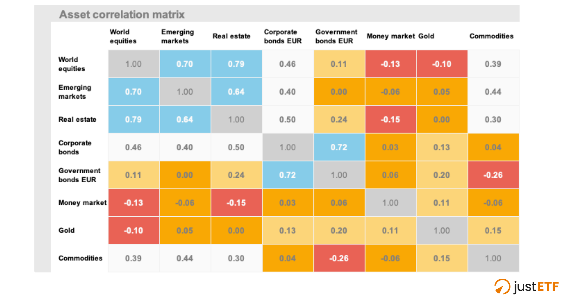
ETF asset class correlation matrix
The table shows you the asset correlation numbers for a range of classic ETF portfolio diversifiers:
Here’s how to read the table:
Each score measures the correlation of a pair of asset classes using monthly ETF returns.
For example, if you read down the World equities column, you can see that the asset class is strongly correlated with emerging markets (0.7). The pair mostly rise and fall together.
Further down, you’ll notice that world equities have a negative correlation with gold (-0.1). That score is functionally close to 0, meaning the two assets mostly act independently of each other. Though the negative sign shows they have a tendency to move in the opposite direction at times. That warrants a closer look.
The table isn’t all about equities, though. You can read down the money market column (or across its row) to view the asset class’s relationship with bonds, gold, commodities and real estate, as well as equities.
Money market has a low to negative correlation with every asset class in the table, so it looks like an excellent diversifier.
You can safely ignore the grey 1.0 boxes, as an asset can’t very well diversify itself.
justETF tip: Correlations aren’t percentages. 0.8 doesn’t mean the assets move together 80 % of the time. It’s better to treat the numbers as a rough guide to diversification potential:
Above 0.5 = Weak diversifiers (blue zones)
0.3-0.5 = Moderate diversifiers (white zones)
0.1-0.3 = Good diversifiers (pale orange zones)
Below 0.1 = Excellent diversifiers (dark orange and red zones)
What’s the table telling us?
The blue zones indicate we’re looking at relatively poor diversifiers. When world equities go down, emerging markets and real estate probably won’t do much to cushion the blow.
The red zones are your diversification hot spots. They indicate that money market and gold sometimes tilt in the opposite direction when equities go into reverse.
Bear in mind a negative correlation means the relationship also works the other way round. Thus, money market and gold will probably fall sometimes when equities are on the charge.
We need to investigate that further, but -0.1 is a low negative correlation (the extreme is -1) so the effect probably isn’t severe.
Any shade of orange is potentially useful while white is distinctly so-so.
Sometimes it’s worth digging deeper into a "white zone" relationship.
For example, if you own a 60/40 equities/government bonds portfolio, then commodities can play a role as a powerful bond diversifier.
The commodities/government bonds score of -0.26 suggests that commodities may compensate for bonds’ weaknesses.
On the other hand, corporate bonds look less useful as a 60/40 portfolio add-on because they’re strongly correlated with govies and moderately correlated with equities.
The ideal equities’ diversifier
The ideal diversifier makes a positive overall contribution to your portfolio and is only negatively correlated with equities when the stock market falls.
In other words, our perfect asset always rises when equities decline and otherwise doesn’t ever bother us with negative returns.
Needless to say, this ideal portfolio partner doesn’t exist.
Instead, the best we can do is to diversify across a range of assets that tend to raise their game in different market environments. We also have to accept that sometimes the diversifiers won’t deliver on cue.
This is where rolling correlations come in handy.
Rolling correlations: how the diversifiers stack up
The correlation scores above track the relationship between two asset classes over the last two decades. As such, the numbers are averages that smooth over a great deal of noise and history.
That has two immediate consequences:
Correlation numbers change over time.
It’s worth digging into how correlations shift under different market conditions. That helps us separate out the real diversification contenders from the also-rans.
Here’s what the higher-resolution view shows us:
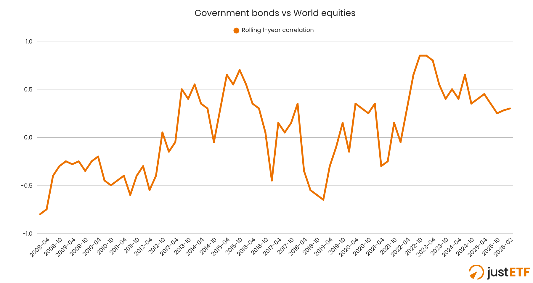
Government bonds: the traditional equity diversifier
Source: justETF research, 23.03.2026. Correlation based on rolling 1-year returns (Dec 2006 - Feb 2026).
This chart reveals the two sides to government bonds. Firstly, govies exhibit negative correlations with equities during every correction and bear market from the Global Financial Crisis through the Covid Crash. That’s exactly what we want to see.
But the two assets became highly correlated (over 0.8) as the post-Covid inflationary surge unfolded.
At the time, world equities slid from their market peak to 17 % down by June 2022. Unfortunately, government bonds were also down 16 %.
That synchronised dive shows up in the chart as a rising correlation curve over the next 6 to 12 months. That’s because we’re measuring rolling 12-month returns, so each event feeds through the trendline over time.
If you held government bonds during 2022 then you know they took a hard hit that year because the asset class is highly vulnerable to inflation.
The verdict: The chart shows government bonds are a good diversifier when the problem is a recession or slowing demand in the economy. On the other hand, they can fail badly when your foe is a major inflationary shock.
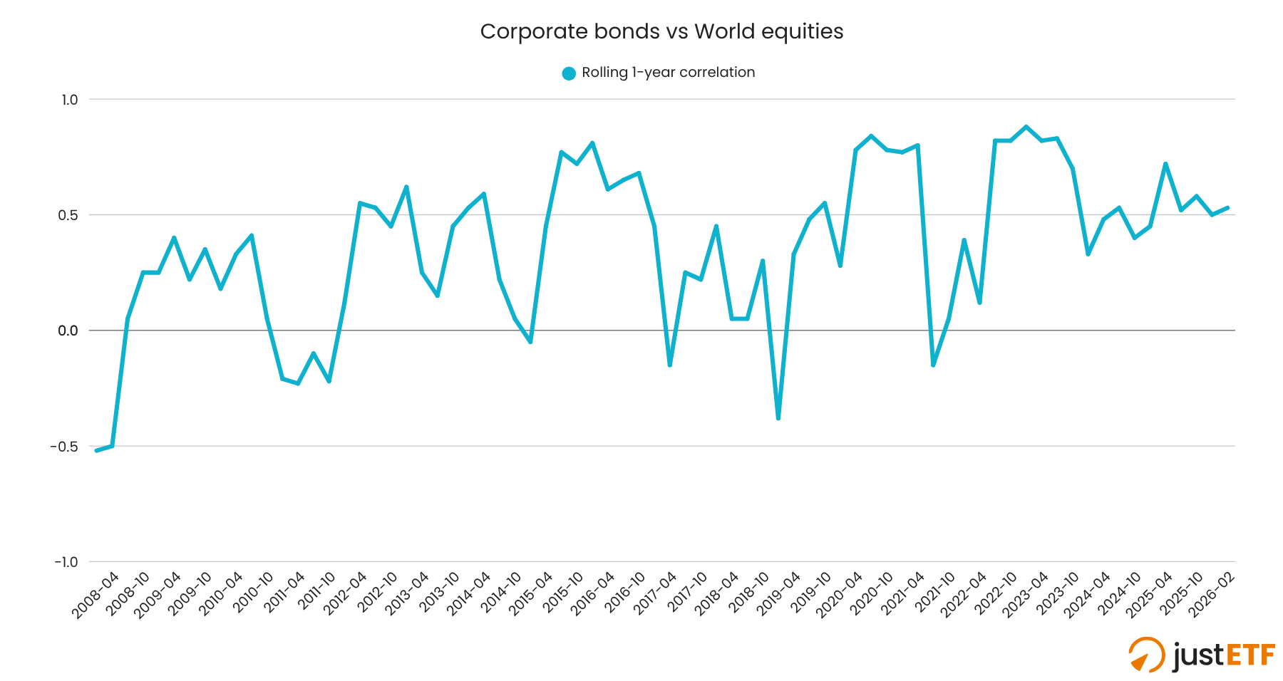
Corporate bonds: do you need them?
Source: justETF research, 23.03.2026.
The corporate bond / equities relationship looks similar to the government bond one - just not as good.
The correlation trend line turns negative in the same key places on both bond charts but the plunges are shallower and shorter lived for corporates.
It’s a signal that corporate bonds are less likely to chip in a positive return when equities flop.
Sure enough, that’s what the historical returns record shows, too.
You can confirm this by comparing a world equities, government bond, and corporate bond ETF using our Compare selection in detail tool.
Look for telltale dips in the equities trend line, then customise the calendar dates to zoom into the trouble spots. Now you can clearly see how each diversifier performed when equities spluttered.
Or check out the results in our ETFs for market downturns white paper.
The verdict: Corporate bonds are typically a pale imitation of their government counterparts when downside protection is your priority.
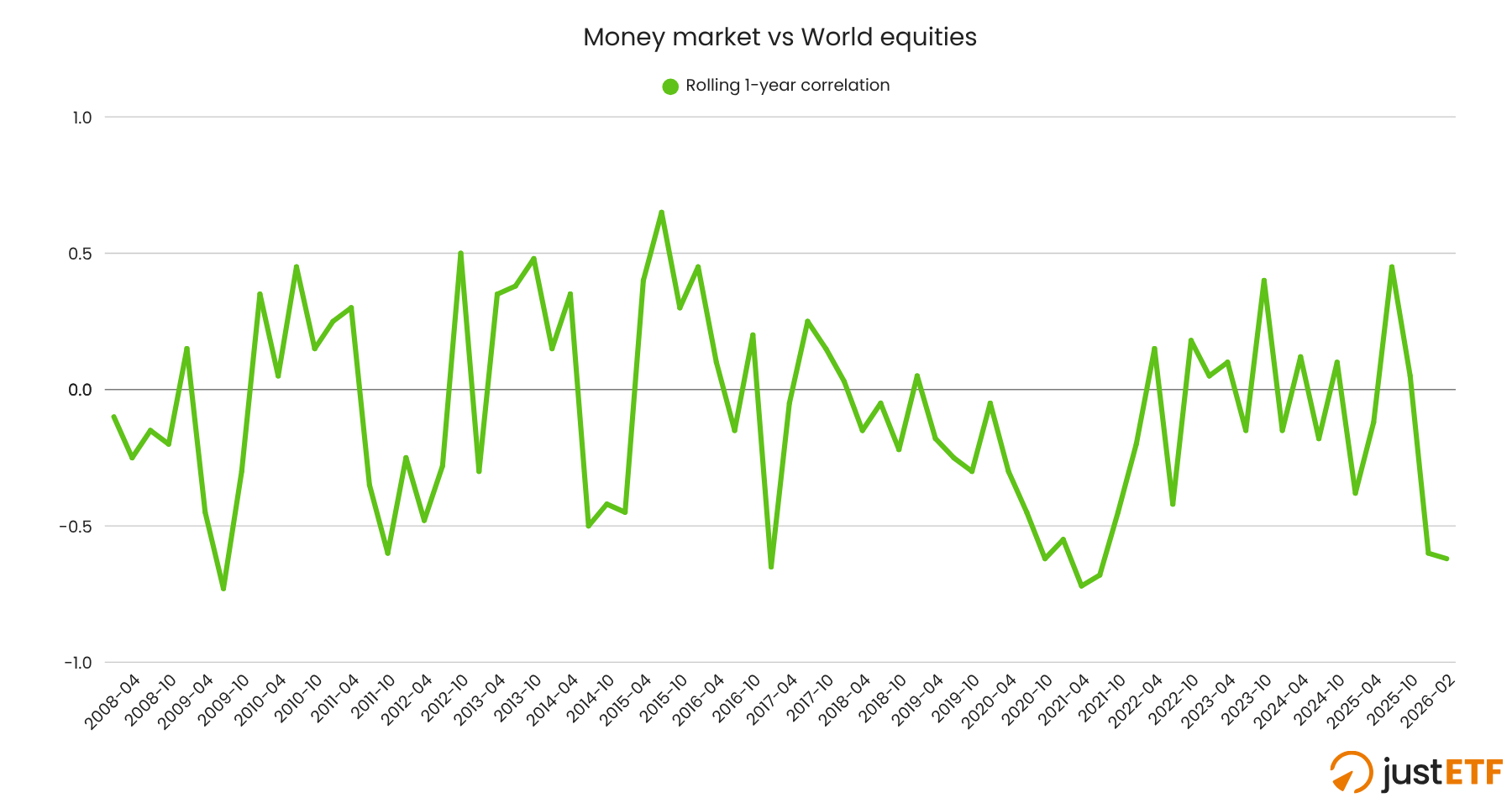
Money market: the star diversifier?
Source: justETF research, 23.03.2026.
A money market ETF is a good diversifier and the chart only confirms this.
For example, take a look at the negative dip in the line over the course of 2022. That’s our money market ETF bearing up as interest rate hikes and inflation undermined equities.
What correlation doesn’t show, however, is the magnitude of returns in either direction.
We know that a money market ETF generated a positive return when equities declined, but that’s because the asset class almost always generates a positive return.
It’s a boring, stable, cash-like asset and deliberately so. The trade-off is that money market ETFs earn less than government bonds over time. Sometimes they aren’t as responsive during demand shocks either.
The verdict: A money market ETF deserves its place in your asset allocation mix for sure, but it’s not a one-and-done answer to diversification.
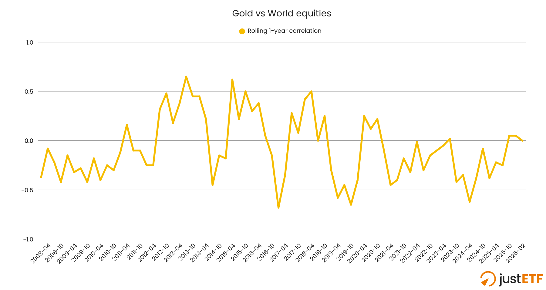
Gold: the shiny maverick
Source: justETF research, 23.03.2026.
Gold has a stellar track record as a diversifier in the ETF era. It countered equity falls during every bear market and correction, including the 2022 inflationary outbreak.
However gold did not perform this service during the 1980s and 1990s before ETFs arrived on the scene.
Gold is also a very volatile investment. You have to be prepared to handle its abrupt changes in fortune.
Gold dropped 31 % in 2013, for instance. Equities were riding high at the time, and you can see the correlation score turn sharply negative as those data points saturate the trendline in 2014.
The verdict: Gold is the standout diversifier of the ETF era. But don’t overcommit. The precious metal is a tricky customer and can inflict reversals that are just as painful as the worst equity bear markets. Happily, gold and equities slumps rarely happen at the same time.
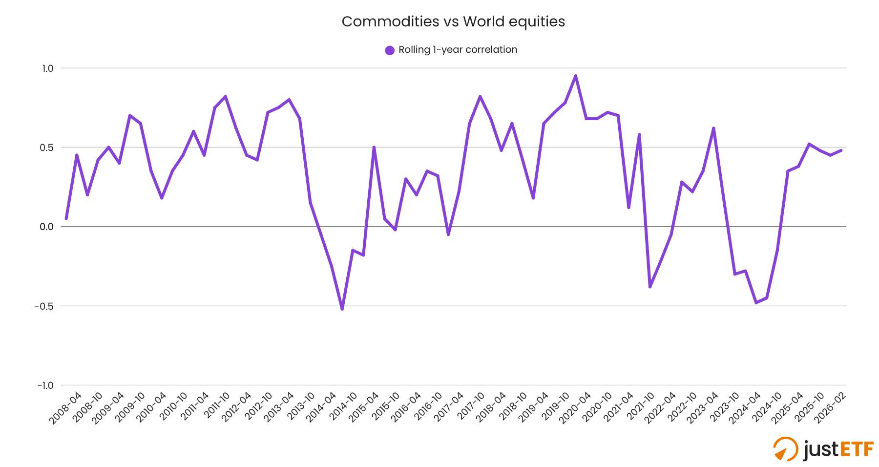
The anti-inflation diversifier
Source: justETF research, 23.03.2026.
Broad commodities suffered a dreadful bear market from July 2008 through to May 2020. Since then, they’ve grown faster than World equities.
The reason is inflation. Commodities perform when consumer prices sky rocket. You can see it in the chart when the correlation line inverts during 2022.
The MSCI World ETF, SWDA, returned -13 % that year. In contrast, the commodities ETF, COMG, brought home 29 %.
Commodities are the only asset class currently responding well to the Iran War supply shock too.
That’s because commodities thrive when raw materials are in short supply and inflation escalates. The pattern has repeated time and again throughout investing history.
That’s why commodities are a useful diversifier - especially as most other asset classes hate surging inflation.
The downside is commodities can spend years in the red. They’re not for the faint-hearted.
The verdict: An excellent inflation hedge that can be very hard to live with at other times.
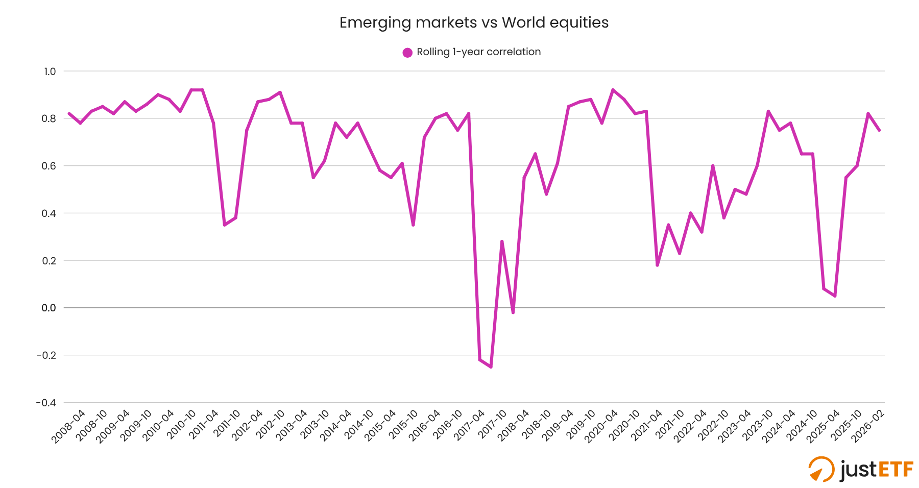
Equity diversifiers: emerging markets and real estate
Source: justETF research, 23.03.2026.
Emerging markets and World equities rarely stray from their highly correlated two-step, though the trend line does invert occasionally.
Unfortunately, emerging markets didn’t once decouple from World equities when the latter was under pressure during this era.
That said, Emerging markets can be useful as a diversifier of equity market returns (as opposed to a diversifier from equity market returns.)
Emerging markets have outperformed developed markets for significant stretches in the past, so they may offer a welcome returns boost again in the future.
The verdict: No role as a defensive asset. Potentially useful as an equity's return diversifier.
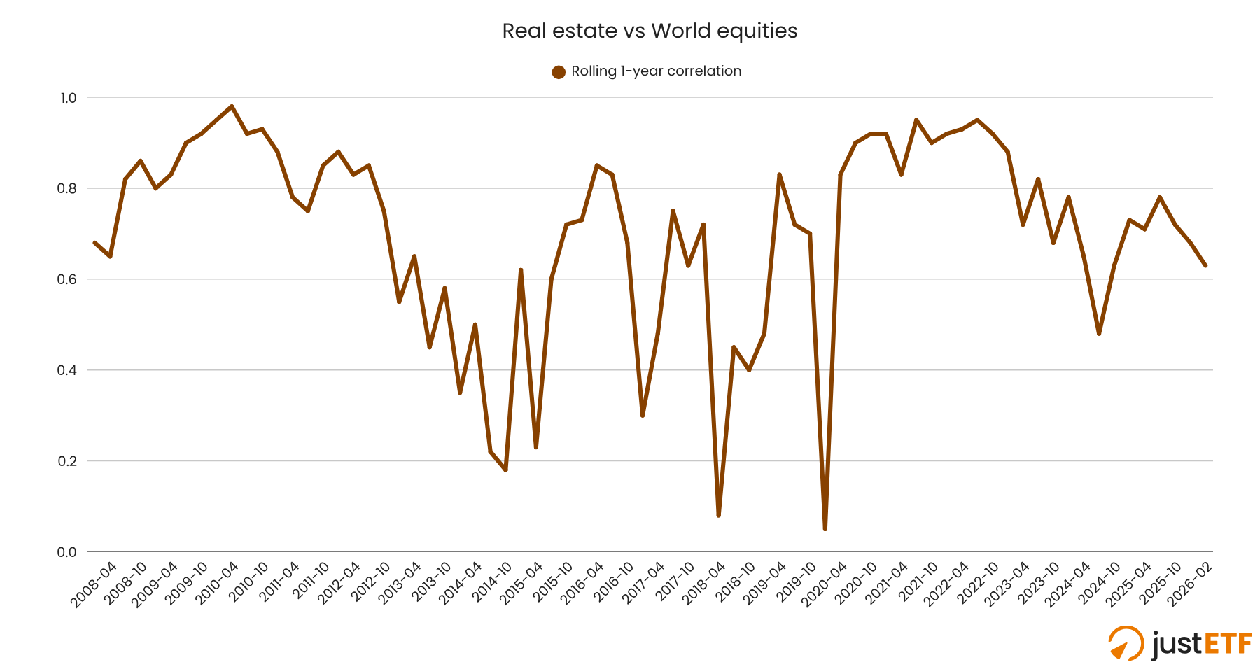
Source: justETF research, 23.03.2026.
Real estate ETFs fill the same diversification niche as emerging markets. They may outperform equities at times but they offer slim hope of downside protection during a crisis.
The verdict: Forget about real estate as a shock absorber.
Our conclusion
Diversification is tricky because no ETF is guaranteed to dampen your losses when equities tank. However, at least one defensive asset class usually steps up in a crisis.
For that reason, it’s a good idea to think of your diversifiers as a series of overlapping armoured plates. Cover yourself against as many threats as possible (inflation, deflation, recessions, stock market crashes, and debt crises) while bearing in mind that every countermeasure has its own weak points.
Think about the threats that worry you the most and which are most likely to derail your objectives. Then invest in the appropriate diversifiers and consider their back-ups too.